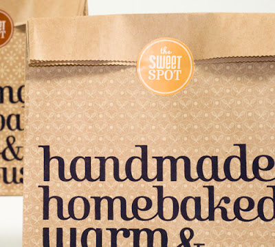
Today we want to present to your attention the development of corporate identity for The Sweet Spot. By using warm colors and interesting font designer Kayd Mustonen has created the ideal concept for the brand for a comfortable, home-bakery. Since the bakery to be proud of naturalness of their products is quite logical to use the brown and beige colors that correspond to the term “naturalness” in the minds of many people. The Sweet Spot can bring home their products and such packaging will surely add some pleasant moments.
Popular Posts
-
We’ve prepared something special for you at this weekend. Stunning and gorgeous illustration of graphic designer from Russia Cornacchia. Whi...
-
Top 10 Most Beautiful Female Athletes Of All Over The World
-
Artist KAWS has recently collaborated with The Standard Hotel in creating a limited edition (1,000 sets) of an enhanced version of the light...
-
W Hotels has just announced plans for the Namaste Tower, a new W Hotel in Mumbai that is due to open July 2015. To follow the long tradition...
Labels
- “Audi Shark” was the winner of 2009 World Auto Design Contest (1)
- 9 Famous Sweaters We’ll Never Forget (1)
- Air Mouse (1)
- Alexandre Dubosc (1)
- All Over The World (1)
- Amazing (3)
- amazing pic of dogs (1)
- amazing picture (1)
- Art Photos (1)
- associated with Alzheimer’s disease (1)
- Audi Shark (1)
- Balblair Scotch Whisky 1989 Special Edition (1)
- Basketball (1)
- Basketball Moments (1)
- beautiful eggs (1)
- beautiful nature and conceptual photography will be surelys (1)
- Beautiful princesses and scary monsters (1)
- building (1)
- Buisness CardsAmazing Buisness Cards (1)
- Carlos Noguera from Guatemala. (1)
- CASA DE LA FLORA RESORT (1)
- Catch the moment with Adidas Originals (1)
- Certainly (1)
- Choi Xooang (1)
- collection (1)
- colors (1)
- Contemporary artist (1)
- Corporate Identity for The Sweet Spot (1)
- Creative Art Photos (1)
- Creepy Forests (1)
- Cup is Sharona Merlin (1)
- Dietary “Slim Cup (1)
- different point (1)
- Eco Concept Car (1)
- Eggs of insects (1)
- elcome to Fairy Tale (1)
- Estonian designer Pavel Sidorenko (1)
- eVouse (1)
- Fabulous Artworks (1)
- fantastic landscapes (1)
- forests under fog (1)
- fun of fun (1)
- funny dogs (1)
- Ghost in the Machine (1)
- horror movie forests (1)
- Hotels in Hollywood (1)
- Indian architecture (1)
- information (1)
- Instead of the same old traditional fuzzy sweaters that I normally choose (1)
- Limited Edition XX Light Bulbs (1)
- located in Khao Lak - Thailand (1)
- Los Angeles Downtown (1)
- Luxury Hi-Tech “Flying Yacht” (1)
- Made out of recycled cassette tape with original cassette (1)
- men arts (1)
- mockery (1)
- Modren dogs (1)
- Moments (1)
- Most Beautiful (1)
- Multidisciplinary Design Studio NT.GJ has created extremely (1)
- Namaste Tower in Mumbai (1)
- New Concept (1)
- New York (1)
- New York design studio Studio Intraligi. (1)
- Next are extremely comfortable lounge (1)
- nice (1)
- Nieuwe Heren and it combines both lamp and folding chair (1)
- Novartis Reflections Campaign (1)
- Peter Kemp from Netherlands (1)
- published the pictures of their new concept: a bicycle (1)
- Purple and Green (1)
- Re Vinyl – New Life of Old Records (1)
- reality (1)
- Red (1)
- Regular Mouse (1)
- Stunningly Beautiful PhotoWonderful landscapes (1)
- Sunglasses Fashion (1)
- Sunglasses were invented to hide your eyes from bright sun. (1)
- Sweet Spot. By using warm colors and interesting font designer Kayd Mustonen (1)
- The Poets Series (1)
- The Renaissance Take On The Series (1)
- This morning I booted up the Star Wars series (1)
- Tim Wigmore’s Contemporary Furniture (1)
- Top (1)
- Top 10 (1)
- Uncomfortable (1)
- Uncomfortable Basketball Moments (1)
- verrückten Leuten begegnen. (1)
- Vespa inspired sculptures are the art works of an Australian artist Patricia Piccinini. (1)
- WAS MAN IN DER U-BAHN ALLES SIEHT (1)
- wow. very nice (3)
- You can pick up a huge number of such epithets while viewing these artworks (1)
Blog Archive
-
▼
2011
(34)
-
▼
September
(29)
- CASA DE LA FLORA RESORT
- WAS MAN IN DER U-BAHN ALLES SIEHT
- Sunglasses Fashion
- The Renaissance Take On The Series
- 9 Famous Sweaters We’ll Never Forget
- Catch the moment with Adidas Originals
- Audi Shark
- Art Photos
- New Concept
- Fabulous Artworks
- Welcome to Fairy Tale
- Tim Wigmore’s Contemporary Furniture
- Balblair Scotch Whisky 1989 Special Edition
- eVouse – Regular Mouse and Air Mouse
- Corporate Identity for The Sweet Spot
- Eco Concept Car
- Ghost in the Machine
- Re Vinyl – New Life of Old Records
- Top 10 Most Beautiful Female Athletes Of The World
- Novartis Reflections Campaign
- Luxury Hi-Tech “Flying Yacht”
- Uncomfortable Basketball Moments
- Dietary “Slim Cup
- Contemporary artist Choi Xooang
- The eggs of insects
- Creative Art Photos
- Modren Dogs
- The Poets Series
- Limited Edition XX Light Bulbs
-
▼
September
(29)


0 comments:
Post a Comment